

Agata Ciechomska is a visual artist based in Lodz, Poland. She holds a Bachelor of Fine Arts in Textile Design from Lodz University of Technology, Poland, and a Master of Fine Arts in Textile Design from University of Borås, The Swedish School of Textiles. Her artworks have been exhibited both, within and outside Europe.
Agata's work explores colour perception in relation to material and light as colour appearance is a complex phenomenon. Depending on the properties of an object, absorption or reflection of light, humans are able to perceive it in certain colour. But perception of colour depends not only on presence of light. Its intensity and temperature depends also on adjacent surfaces and spatial placement called colour context. In addition, the notion of colour context leads further to visual colour mixing.
This phenomenon, also known as optical mixing, can be observed in the artworks. It occurs when small areas of colour placed next to each other, when viewed from a distance blend and create a new colour produced directly in the retina of the eye. That means, in order for the art to become real, an active participation of the viewer is essential.
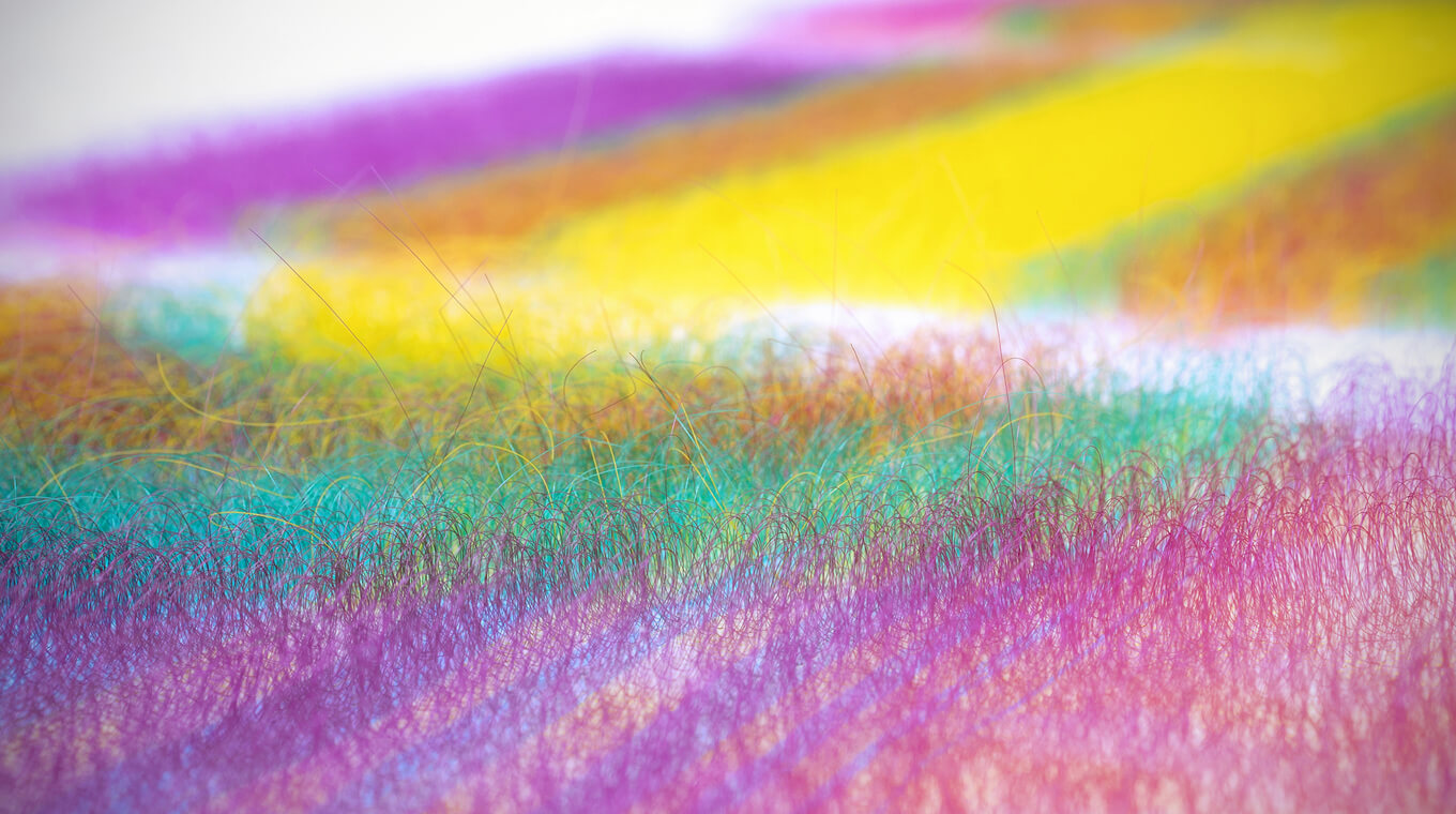
The artworks seen from the front seem less dense and intense in colour, whereas when viewed at an angle, look more homogeneous and colours get more vibrant, therefore it is the movement of a viewer that enables the transitions and changes the reality.
Selected exhibitions
Awards & Scholarships
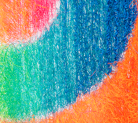

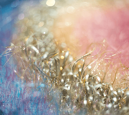
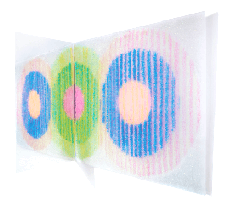
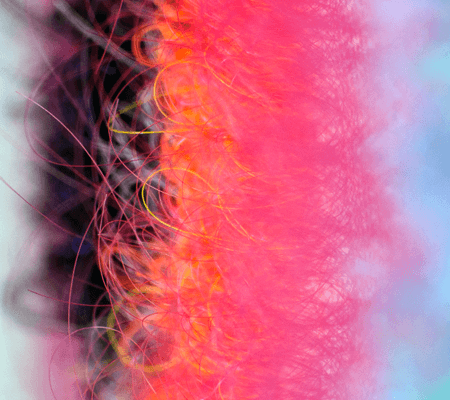
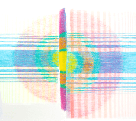
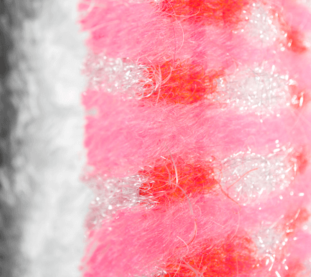
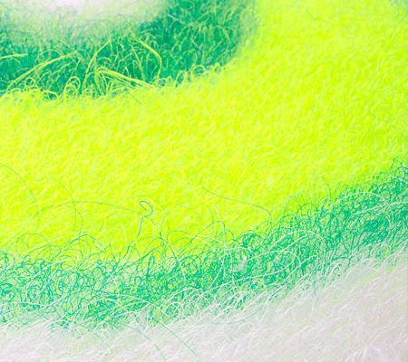
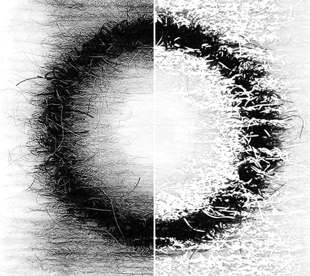
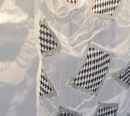
The Open Structures is the investigation into the openwork surfaces that can be created by means of yarns combination in jacquard weaving technique. Furthermore this project aims to show how the light affects three-dimensional structures and enhances transparency of textiles.
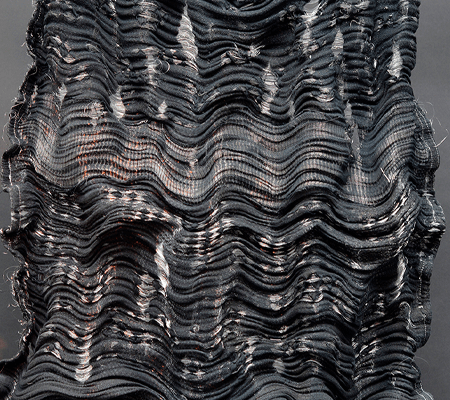
The Suspended Islands is the investigation into the openwork surfaces that can be created by means of yarns combination in jacquard weaving technique. Furthermore this project aims to show how the light affects three-dimensional structures and enhances transparency of textiles.
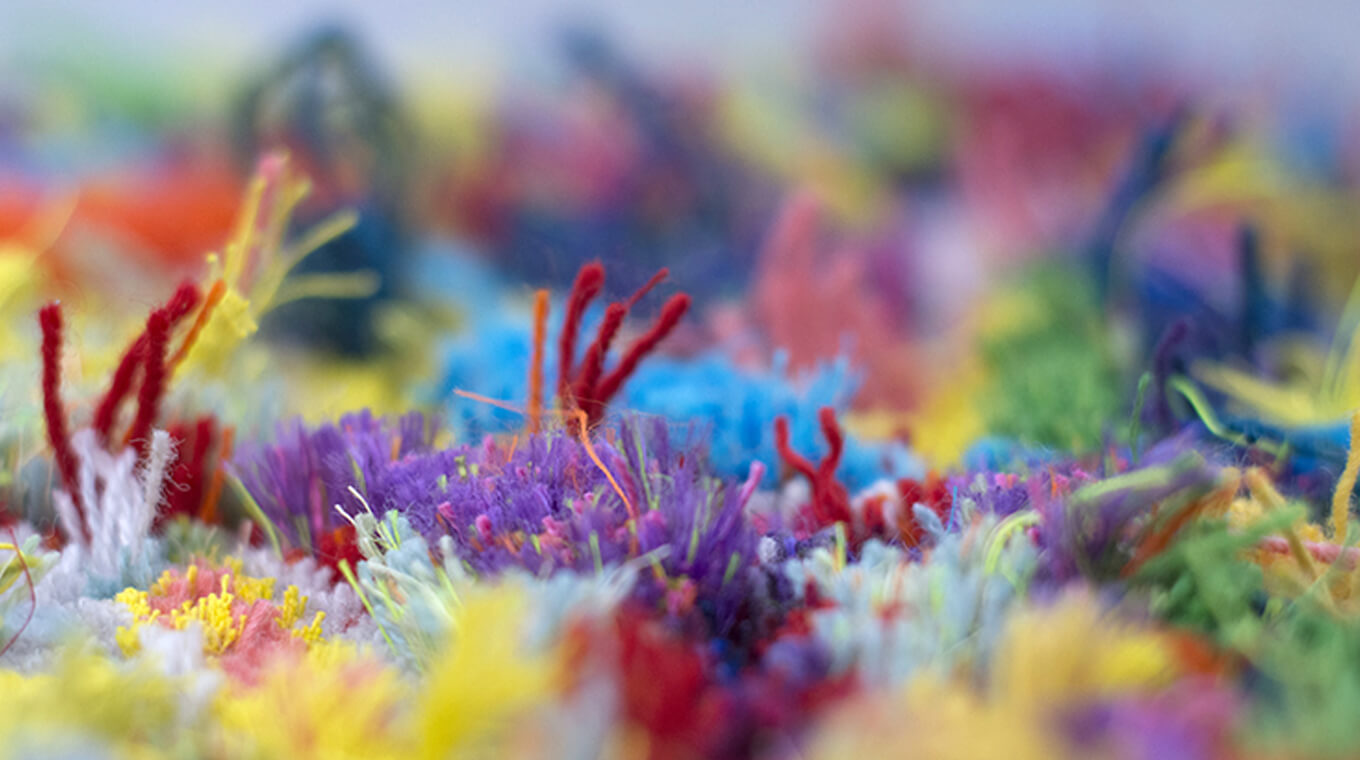
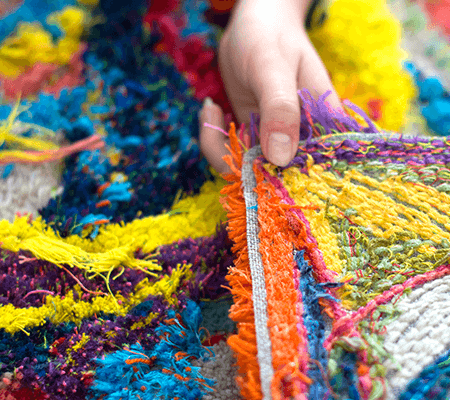
The Action Tufting project is based on action painting movement and its methods of working. Therefore the fundamental rule was to approach the canvas without picturing the final result with a tool, which in this case was the hand tufting gun loaded with the set of yarns, and by that enjoying spontaneous action of creation.
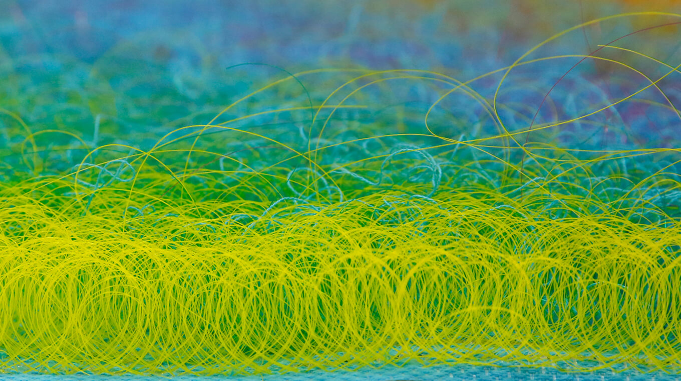
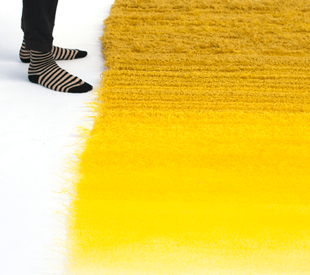
"Brighten" is the investigation of colour gradient caused by material change executed in hand tufting technique. Tufted loops are performed with gradual material change, from wool through linen and cotton, up to monofilament, and that is directly linked to the colour intensity the viewer is perceiving. Both, contrast between different yarn qualities, and transparency of the backing material have a great ability to enhance colours as well as add certain kind of lightness to the piece, and by that enable a completely new expression of hand tufted material.
When imagining a rug, a very specific image appears in our mind. Some details of that image could vary from person to person, but what is almost certain, dense and heavy, probably made out of wool, woven textile will pop up in front of our eyes. Triptych Solaris is exploring colour gradient caused by material change executed in hand tufting technique and suggests a possibility of creating new expressions to this field. Tufted loops are performed with gradual material change, from wool in outer circle through flax and cotton, up to monofilament in the middle of the work. That is directly linked to the colour intensity the viewer is perceiving. Both, contrast between different yarn qualities, and transparency of the backing material have a great ability to enhance colours as well as add certain kind of lightness to the piece.
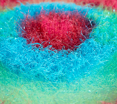
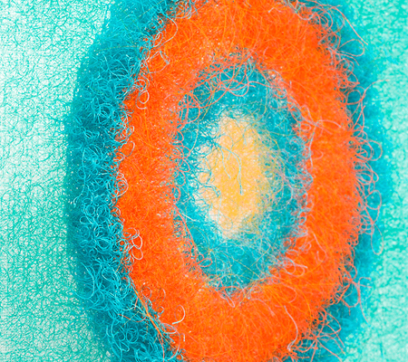
Colour combinations can sooth each other as well as they can create a tension and stimulate the eye. ‘Decisive Orange’ explores that phenomenon. The orange circle seems to vibrate but it is that strong and vivid only because of its turquoise surrounding that emphasize the simultaneous contrast between those two colours. The artwork seen from the front seem less dense and intense in colour, whereas when viewed at an angle, look more homogeneous and colours get more vibrant, therefore the experience is fragile and it is only an instant that provokes this transition in front of the viewers eyes.
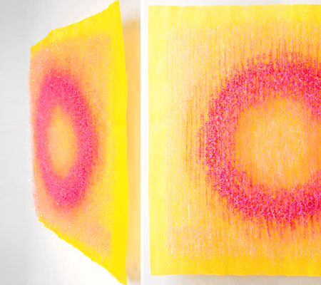
Colour wouldn't exist if it weren't for light. That is why 'All that glitters' is the work celebrating this combination. The pink circle dissolves in a delicate mist of yarn shimmering in the light. In addition, the use of a base canvas made of bright yellow monofilament allows to strengthen the intensity of this connection.
‘Galvanise’ is performed in a monochrome scale and explores how the light empowers unexpected visual expressions. The piece transforms under different light conditions. On top of translucent canvas various types of monofilaments and yarns were hand-tufted, including a reflective thread. Thanks to its properties it reflects the light directed at it at a certain angle. When looking at the work from different distances and perspectives diverse aftermath can be observed, from the intensification of the effect to its complete disappearance. Therefore, in order for the art to become real, active participation of the viewer is essential.
"Lush" thanks to the various materials in different parts of the work shows contrasting expressions. The white square is created from more classical threads, like cotton or polyester, which looks heavy and dull. The centric circles are mainly made out of a monofilament and very thin yarns of different properties. All of that causes the green to shine and look lush, bright and present very light and fresh expression.
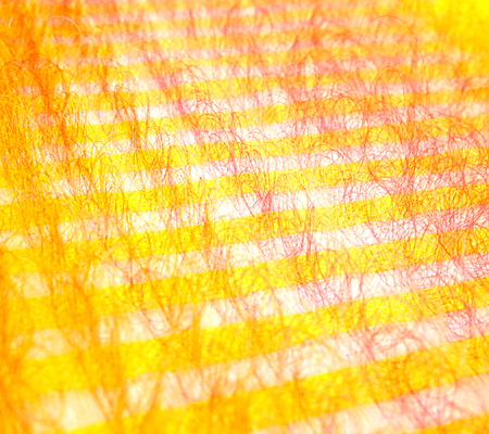
‘Polymorphic Pink’ highlights the spatiality of hand-tufting technique. Thanks to the choice of completely different materials than are traditionally used, the pile loops become semi-translucent and an interaction between them and the woven backing is possible. Therefore, when the work is seen from the front, a check pattern is clearly visible, but when looked at an angle, the vertical stripes disappear and instead only delicate mist of coloured horizontal stripes can be seen.
Triptych ‘Distinct connection’ shows fascinating interplay between its components, embedded in a spatial context. The artworks seen from the front seem less dense and intense in colour, whereas when viewed at an angle, look more homogeneous and colours get more vibrant, but because of the triptych display, it forces a viewer to look at the work from a different angles at the same time, therefore vividness of each piece varies greatly and it is impossible to overlook. Also with a movement of a viewer the colour strength in one piece will fade, while the other will become extra saturated. In addition to colour intensity it is also a pattern within each piece that changes with the movement. Standing opposite to the work, a pattern, a check or a semicircle created form the foreground background interaction, is clearly visible, however when glaring at the work placed perpendicular to a viewer, only vertical stripes formed from colour ‘haze’ will be noticeable. That means that in order for the art to become real, active participation of the viewer is essential.
Colour and Light - an interplay between those two elements embedded in the weaving and hand-tufting technique is the core of the artwork. The work explores the phenomenon of optical mixing that occurs when small areas of colour placed next to each other, when seen from a distance blend and create a new colour produced directly in the retina of the eye. The artwork seen from the front seem less dense and intense in colour, whereas when viewed at an angle, look more homogeneous and colours get more vibrant, therefore the experience is fragile and it is only an instant that provokes this transition in front of the viewers eyes. That means, in order for the art to become real, active participation of the viewer is essential. By that ‘Tickled Pink’ is not only synonymous with a delight in direct title translation but can be also associated with a feeling that is lured by contemplating art.
Installation ‘Colour extension' explores the magic of the colour context. How adjacent surfaces are impacting what we see and how our brain is tricked. Depending on a different colour companion, the same blue yarn is perceived as turquoise or violet-blue. That phenomenon underlines the fact that the same colour is not necessarily only cold or warm but that its temperature depends on the closest surroundings. To expand the spatial context of the exploration a mirror is placed perpendicular to the textile piece. It allows the colours to spread in space and encourages a viewer to walk around the artwork and appreciate colour and form changes appearing with a different angle of seeing.
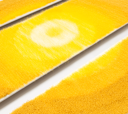
Memories as such are always subjective. Even though human memory relates to the reality, the way we perceive and collect memories is a series of abstracted associations including different senses. A similar approach can be observed in terms of colour perception. Colour intensity and temperature depends on many aspects like, light, adjacent surfaces as well as spatial placement. Small areas of colour placed next to each other, when viewed from a distance blend and create a new colour produced directly in the retina of the eye. Likewise, memories and experiences are adding up and constantly reshaping human perception. Some memories are getting stronger and are like treasures recalled frequently with pleasure whilst some fade away over time. The ‘Piece of Gold’ seen from the front seem less dense and intense in colour, whereas when viewed at an angle, look more homogeneous and colours get more vibrant, therefore the reality is changed with every instant and a slightest movement of a viewer. The fragility and of this experience influences emotions and possibly create a golden memory of that moment.
Spherical, circular and annular orb, a globe of colour and light. This artwork explores colour perception and light in a spatial context. Hand-tufted material shaped and hand-stitched in a three-dimensional structure of a tube is the core. From the inside bright orange pierce through contrasting blue that reinforces the colour dissonance between those two colours, causing a powerful expression stimulating the viewers eye. From the outside, loops are creating a smooth surface of a colour haze. Metallic rings, embroidered with stripes of hand-tufted fabric, surround the core creating volume and a feeling of movement. Moreover, colours overlap and blend creating a new colour produced directly in the retina of the eye. therefore it is the movement of a viewer that enables the transitions and changes the reality.